Category: Project

  • Ralph Ware for Aurora

    Ralph Ware for Aurora

    Client Website:

    Ralph Ware for Aurora 

    Client Background :

    Ralph Ware is already a successful entrepreneur running Warehouse Industries and Real Property Management Valor decided to run for City Council At Large for the City of Aurora. He has already done most of the branding work, including selecting the colors and designing the logo.

    Challenges :

    • The logo was designed, but the client did not have the files.
    • Colors were not the best from the accessibility side.
    • The timeline was super tight; the client’s campaign was dependent on the website being there on time.
    • Client needed a way to get donations from the public.

    Our Solution :

    •  We recreated the logo for use on the website.
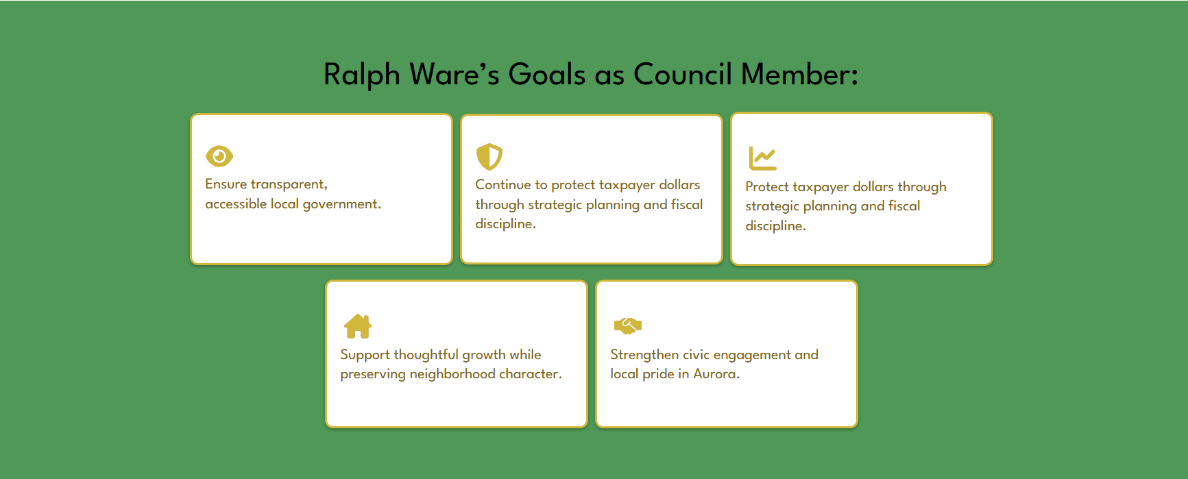
       We predominantly use Green from the log since that works perfectly with black text.
    • We created the Homepage within the 1st week and went through 3 revisions and finalized the Homepage within 8 days.
    • We used GiveWP for the donation, built on Stripe as the payment gateway.

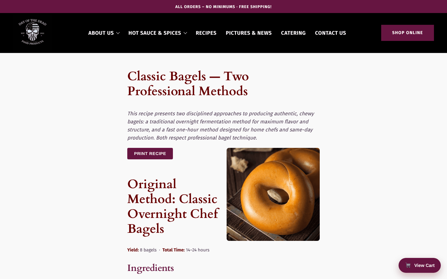
    Visual Samples :


    Hero Section


    Outcome :

    The final website delivered is professional, accessible, and does exactly what the client needs.

    Key Wins:

    • We delivered the website in less than 10 days.
    • We met or exceeded the client’s requirements.
  • Trumbull County History Society

    Trumbull County History Society

    Client Website:

    Trumbull County History Society 

    Client Background :

    The Trumbull County History Society is a cultural and historical organization dedicated to preserving and showcasing the rich heritage of Trumbull County. Their website is a key communication tool for sharing stories, upcoming events, and engaging the community.

    Challenges :

    The client reached out with a clear set of needs:

    • The website design felt too dark and was not easily accessible to all users.

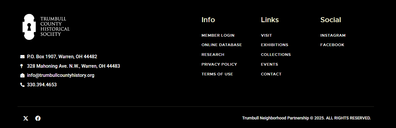
    • Key functions such as SMTP (email delivery) and the footer section were broken.

    • The client did not want a completely new website — they wanted targeted UI improvements and fixes.

    Our Solution :

    We created a plan to carefully improve the usability, accessibility, and design of the existing site without a full rebuild:

    • Accessibility & Visual Overhaul

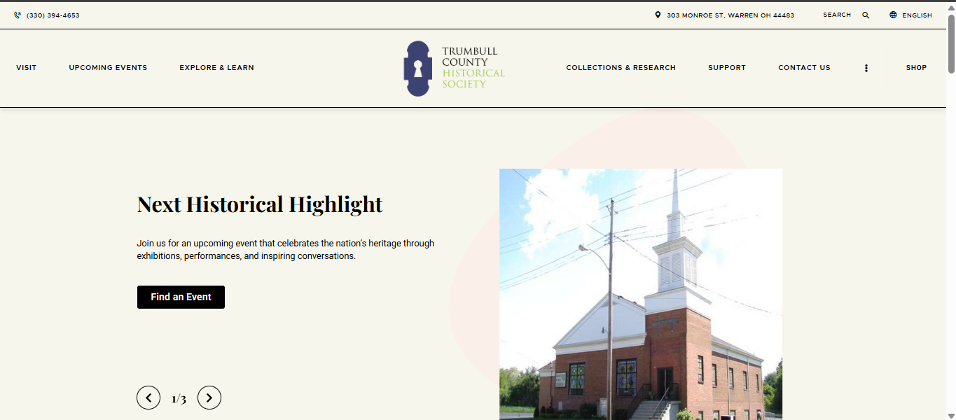
      • Brightened the overall design for better readability and user experience.

      • Applied accessibility best practices for contrast, colors, and text clarity.

    • Header & Footer Redesign

      • Designed multiple variations of the header and footer.

      • Shared staged previews with the client for feedback.

      • Finalized versions were deployed after client approval.

    • Technical Fixes

      • Resolved SMTP issues to ensure emails were delivered correctly.

      • Fixed the broken footer and ensured consistency across all pages.

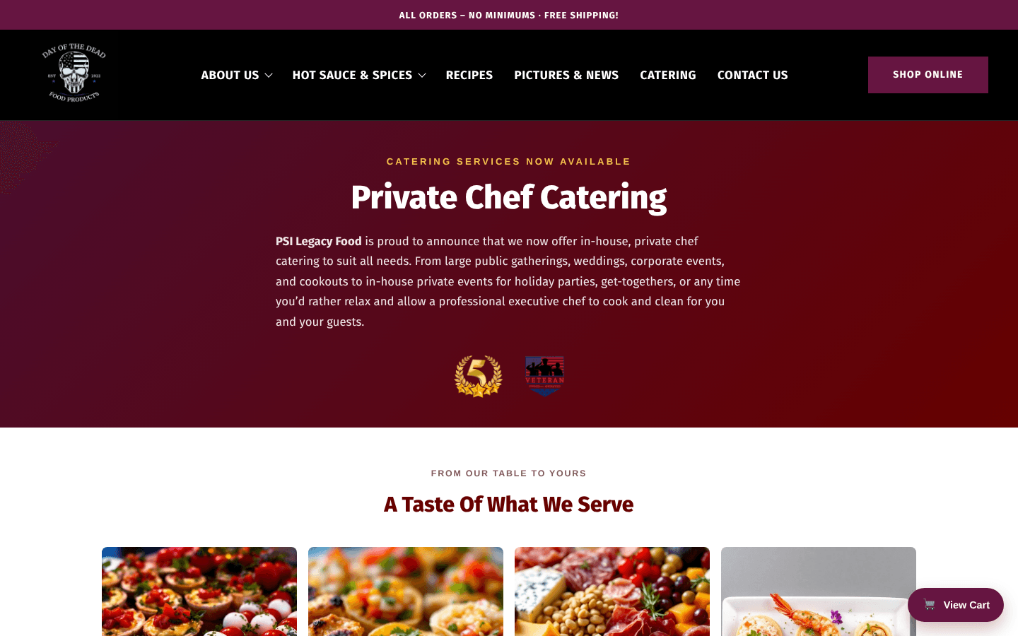
    Visual Samples :


    Footer


    Header


    Site Front Page

    Outcome :

    We successfully delivered a brighter, more accessible website while fixing technical issues. By collaborating closely with the client on design variations, we ensured the final solution aligned perfectly with their expectations.

    Key Wins:

    • Improved accessibility for all visitors.

    • Fixed broken features (SMTP, footer).

    • Updated look and feel without a full redesign.

    • Positive client feedback on the new, refreshed interface.

  • Visano Theranostics

    Visano Theranostics

    Client Website:

    Visano Theranostics 

    Client Background :

    Visano Theranostics is a new startup in the healthcare space. They approached us with a clear requirement: to create a brand-new website that reflected their vision, matched their branding, and stood up confidently against competitor websites.

    Challenges :

    • The client’s preferred color scheme was visually appealing but not ideal for accessibility and readability.

    • The homepage design went through multiple rounds of revisions to ensure it matched the brand identity and expectations.

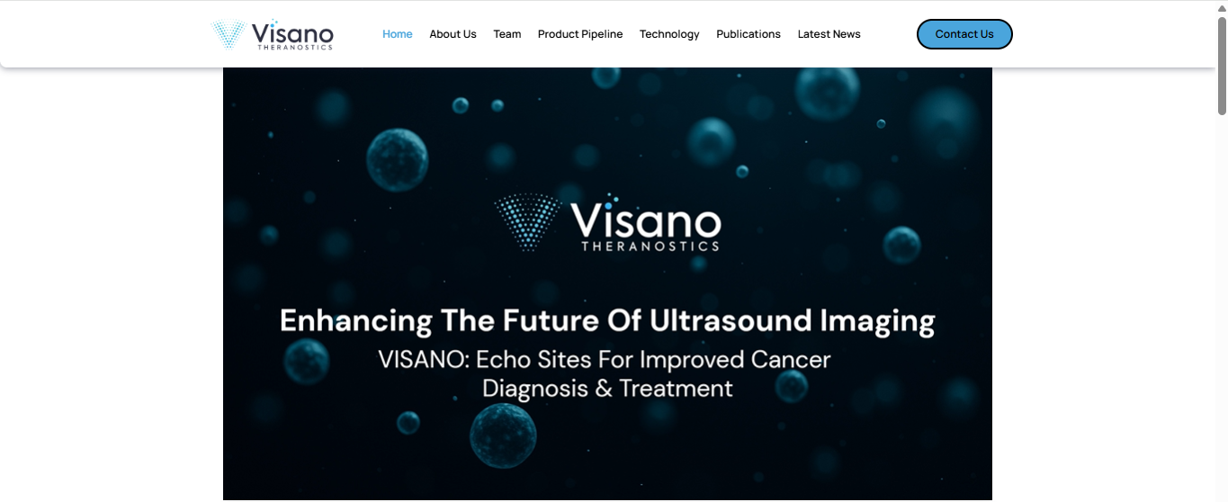
    • A hero section video was provided by the client — an AI-generated video — which presented its own accessibility challenges.

    Our Solution :

    We focused on designing a modern, professional website that aligned with the startup’s branding while also being user-friendly and accessible:

    • Brand-Aligned Design

      • Developed a sleek, professional website that took inspiration from competitor references but retained Visano’s unique identity.

      • Made slight color scheme adjustments to improve accessibility and contrast while staying close to the brand palette.

    • Homepage Iterations

      • Collaborated closely with the client through multiple homepage revisions to perfect layout, messaging, and design.

    • Hero Section Video

      • Integrated the AI-generated video into the hero banner.

      • Optimized and revised video accessibility to ensure smooth playback and usability across devices.

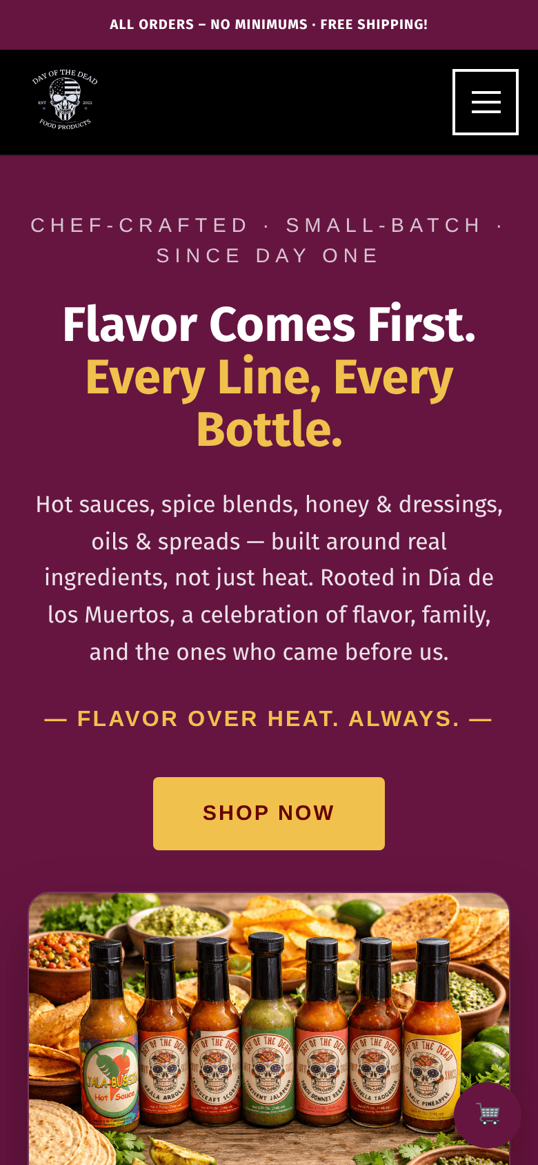
    Visual Samples :


    Outcome :

    The final website delivered a modern, professional, and accessible online presence for Visano Theranostics, providing them with a strong platform to introduce their startup to the world.

    Key Wins:

    • Brand-focused design with accessibility improvements.

    • Homepage refined through multiple client-approved iterations.

    • Successfully integrated and optimized an AI-generated hero video.

    • A polished, professional website launch for a new healthcare startup.

  • ReadiPOD

    ReadiPOD

    Client Website:

    ReadiPOD 

    Client Background :

    ReadiPOD is a new startup launching an innovative product in the market. They needed not only a website but also a logo that reflected their brand identity.

    Challenges :

    • The client required both branding (logo) and a website that aligned with their product vision.

    • While the client already had a logo concept in mind, it needed to be refined and designed professionally.

    • To maximize the new product’s visibility, the website also required SEO-friendly content.

    Our Solution :

    We worked on the project as a complete digital package — from branding to content strategy:

    • Logo Design

      • Took the client’s concept and turned it into a professional, polished logo that matched their product identity.

    • Website Development

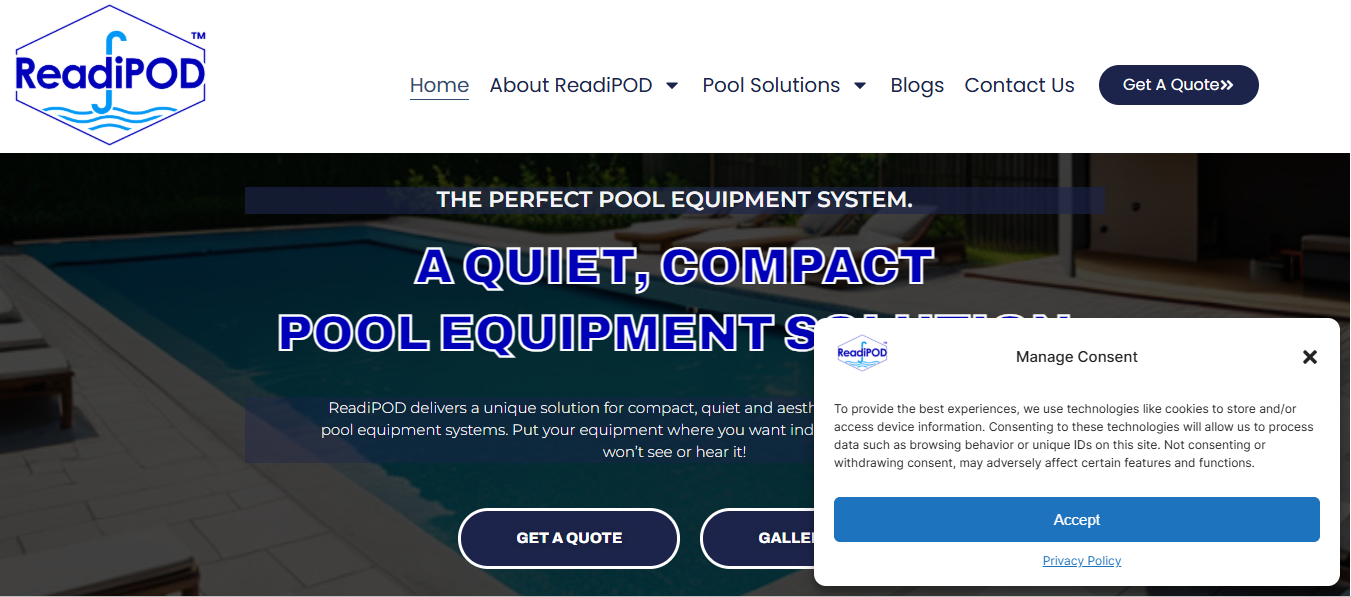
      • Designed and developed a website tailored to the client’s needs and product positioning.

      • Ensured the design was clean, user-friendly, and product-focused.

    • SEO & Content Strategy

      • Advised the client to invest in SEO for long-term visibility.

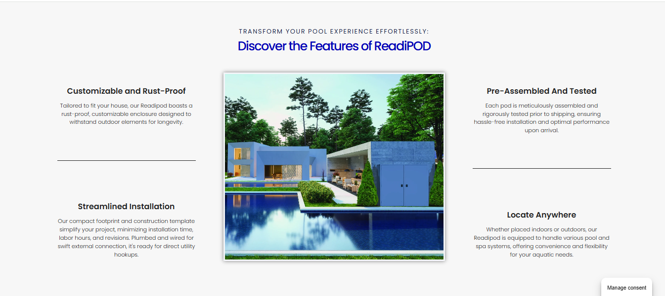
      • Conducted content writing and strategically added high-value content throughout the website.

      • Structured the site for better search engine performance and user engagement.

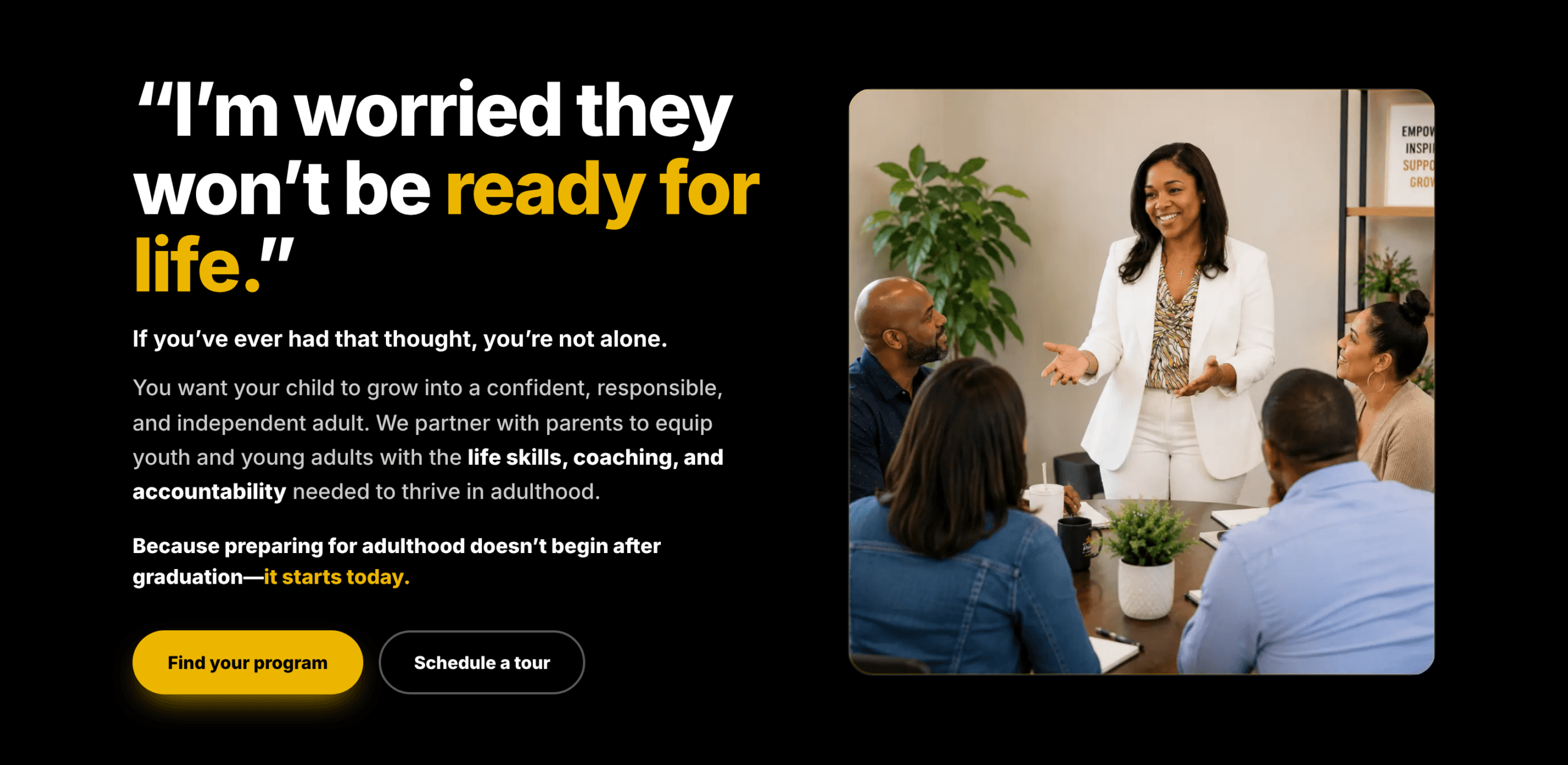
    Visual Samples :


    Outcome :

    The end result was a complete brand presence for ReadiPOD, combining strong visual identity with a professional website and a foundation for organic growth through SEO.

    Key Wins:

    • Delivered a custom logo aligned with client vision

    • Built a professional website for a new product launch

    • Implemented SEO with well-crafted content for long-term visibility

    • Helped position the startup strongly in its market